

Types:
The position property specifies the type of positioning method used for an element.
There are five different position values:
- static
- relative
- fixed
- absolute
- sticky
<body>
    <div class="parent">
      <div class="child one">One</div>
      <div class="child two">Two</div>
      <div class="child three">Three</div>
      <div class="child four">Four</div>
    </div>
  </body>
body {
  margin: 100px auto;
}

.parent {
  width: 500px;
  border: 1px solid red;
  margin: auto;
  text-align: center;
}

.child {
  border-radius: 10%;
  width: 100px;
  height: 100px;
  margin: 20px;
}

.one {
  background-color: powderblue;
}

.two {
  background-color: royalblue;
}

.three {
  background-color: sienna;
}

.four {
  background-color: slateblue;
}
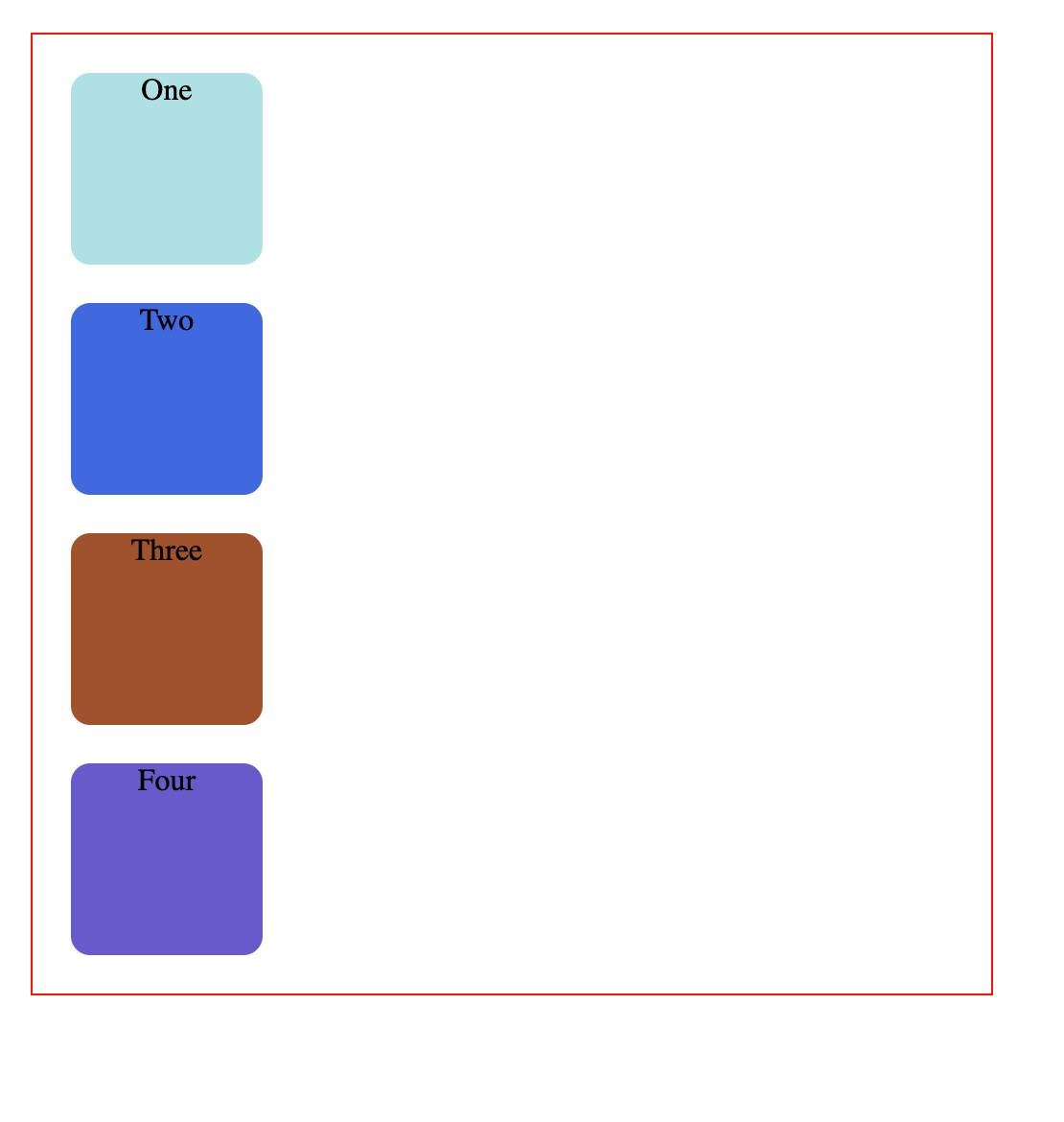
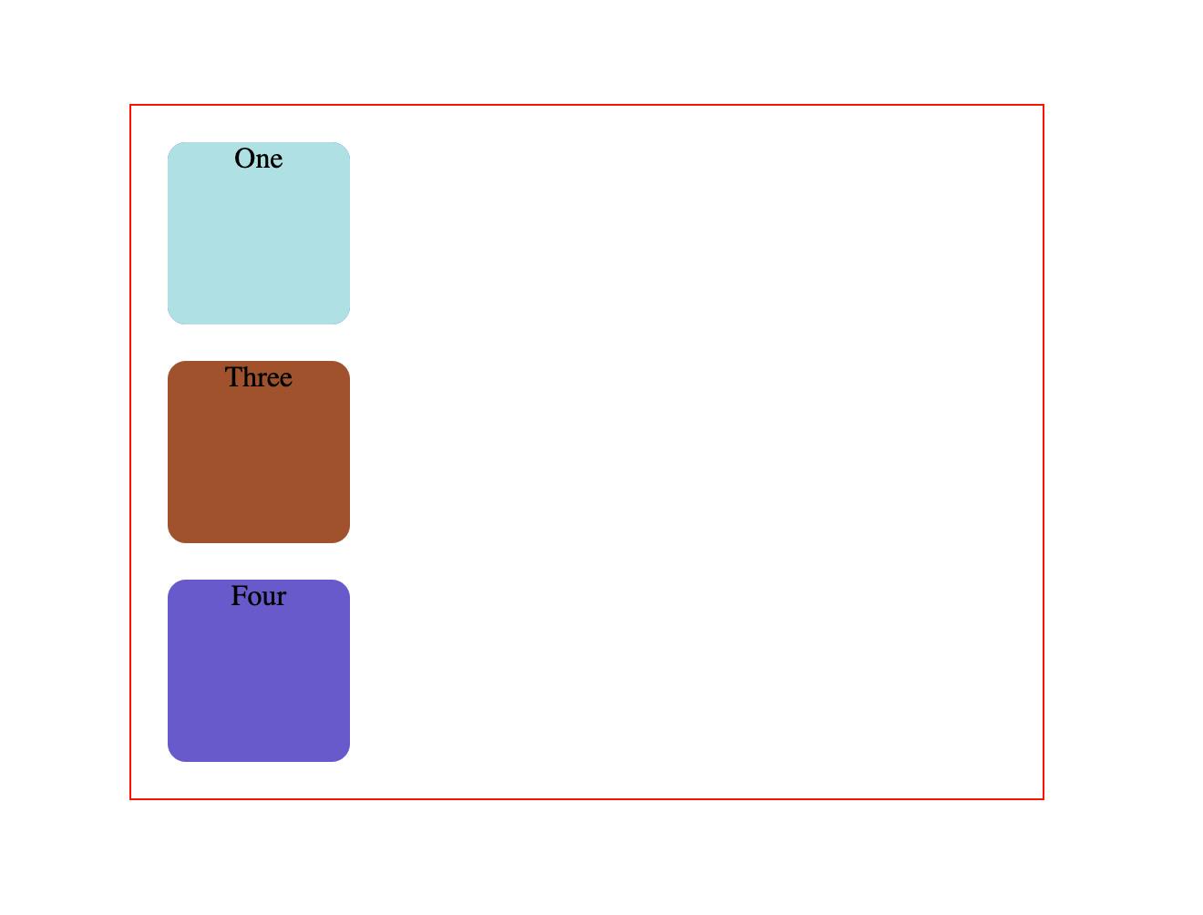
1. position: static;
HTML elements are positioned static by default.
Output
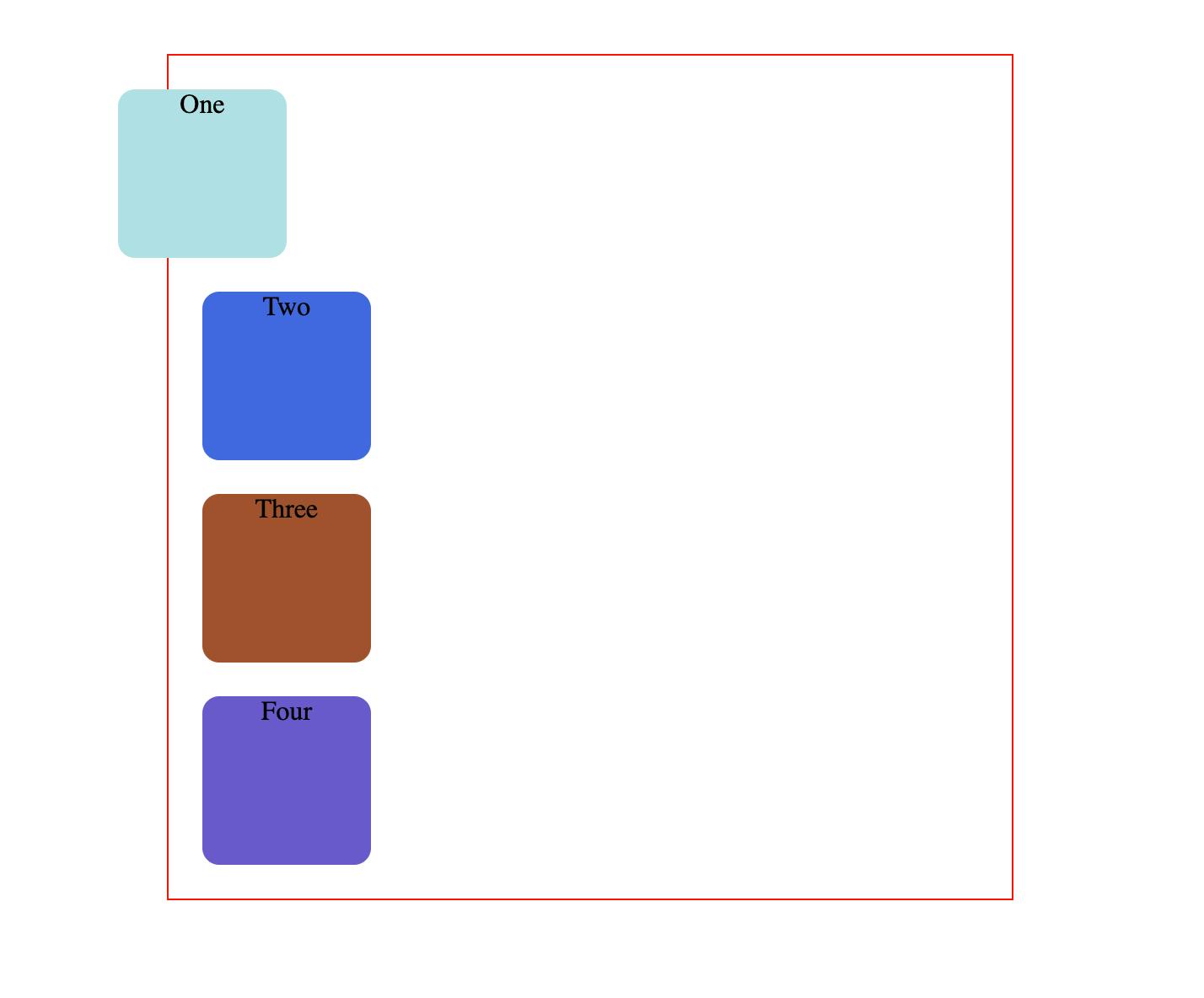
2. position: relative;
An element with position: relative; is positioned relative to its normal position.
Setting the top, right, bottom, and left properties of a relatively-positioned element will cause it to be adjusted away from its normal position. Other content will not be adjusted to fit into any gap left by the element.
.one {
  background-color: powderblue;
  position: relative;
  right: 50px;
}
Output
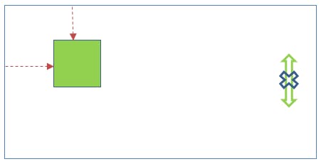
3. position: fixed;
An element with position: fixed; is positioned relative to the viewport, which means it always stays in the same place even if the page is scrolled. The top, right, bottom, and left properties are used to position the element.
A fixed element does not leave a gap in the page where it would normally have been located.
<body>
    <div class="p1">
    </div>
</body>
.p1 {
    width:50px;
    height:50px;
    background-color:lightgreen;
    position:fixed;
    left:40px;
    top:40px;
    }
Output
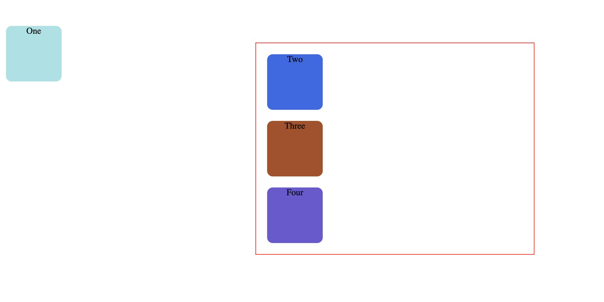
4. position: absolute;
An element with position: absolute; is positioned relative to the nearest positioned ancestor (instead of positioned relative to the viewport, like fixed).
However; if an absolute positioned element has no positioned ancestors, it uses the document body, and moves along with page scrolling.
Note: Absolute positioned elements are removed from the normal flow, and can overlap elements.
example 1:
.one {
  background-color: powderblue;
  position: absolute;
}
Output (example 1)
This is unexpected behaviour . The second square has completely disappeared.
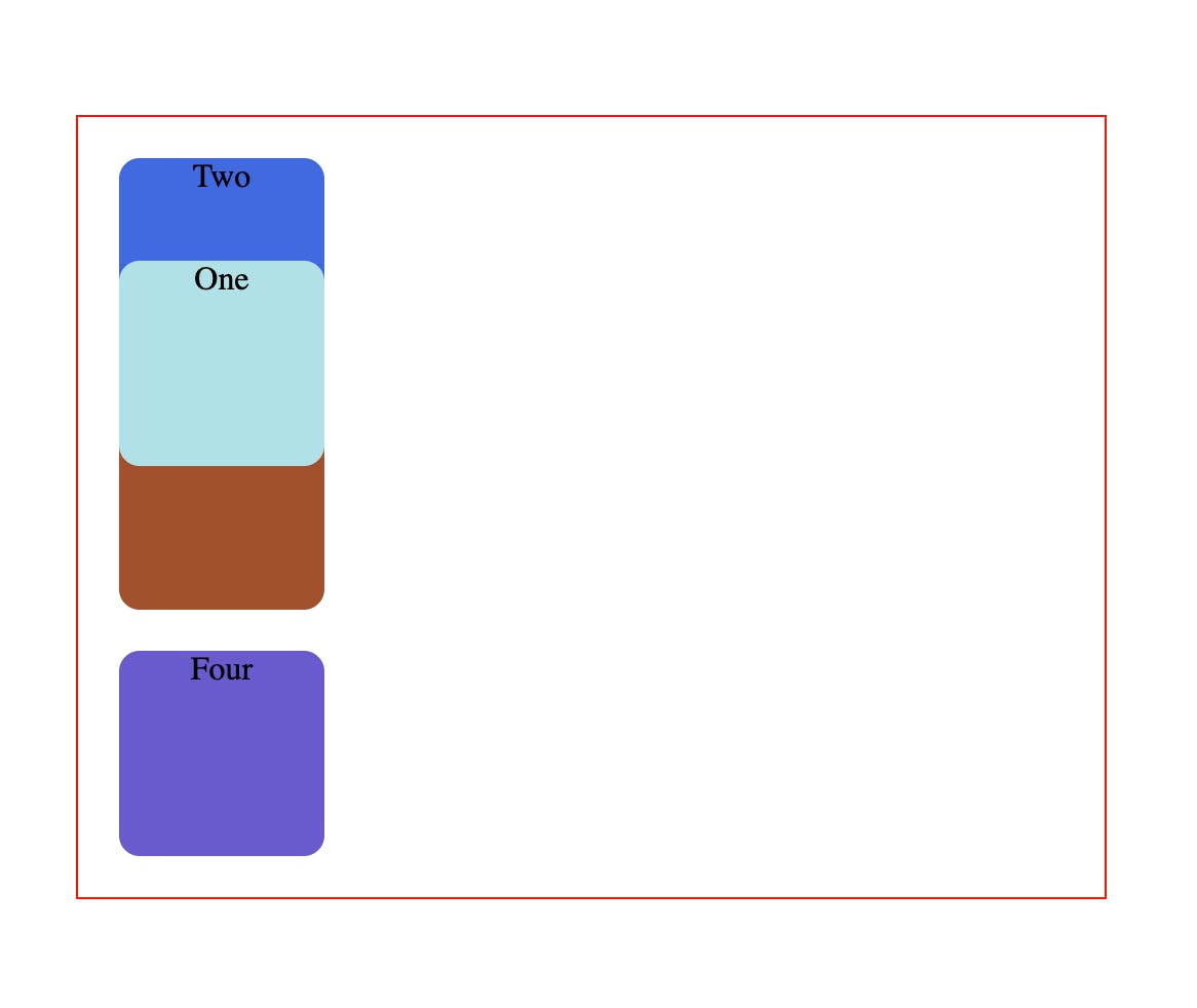
example 2:
.one {
  background-color: powderblue;
  position: absolute;
  top: 50px;
  left: 0;
}
Output (example 2)
Well now the square has completely abandoned it's parent.
Absolute-positioned elements are completely taken out of the regular flow of the web page.
They are not positioned based on their usual place in the document flow, but based on the position of their ancestor.
In the example above, the absolutely positioned square is inside a statically positioned parent.
This means it will be positioned relative to the whole page itself, which means relative to the element – the root of the page.
The coordinates, top: 50px; and left: 0;, are therefore based on the whole page.
example 3:
.parent {
  width: 500px;
  border: 1px solid red;
  margin: auto;
  text-align: center;
  position: relative;
}

.one {
  background-color: powderblue;
  position: absolute;
  top: 50px;
  left: 0;
}
Output (example 3)
Absolute positioning takes elements out of the regular document flow while also affecting the layout of the other elements on the page.
5. position: sticky;
An element with position: sticky; is positioned based on the user's scroll position.
A sticky element toggles between relative and fixed, depending on the scroll position. It is positioned relative until a given offset position is met in the viewport - then it "sticks" in place (like position:fixed).