

The Flexbox Layout (Flexible Box) module aims at providing a more efficient way to lay out, align and distribute space among items in a container, even when their size is unknown and/or dynamic (thus the word “flex”).
The main idea behind the flex layout is to give the container the ability to alter its items’ width/height (and order) to best fill the available space. A flex container expands items to fill available free space or shrinks them to prevent overflow.
Most importantly, the flexbox layout is direction-agnostic as opposed to the regular layouts (block which is vertically-based and inline which is horizontally-based). While those work well for pages, they lack flexibility to support large or complex applications (especially when it comes to orientation changing, resizing, stretching, shrinking, etc.).
Display
This defines a flex container; inline or block depending on the given value. It enables a flex context for all its direct children.
.container {
  display: flex; /* or inline-flex */
}
flex-direction
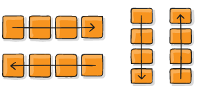
This establishes the main-axis, thus defining the direction flex items are placed in the flex container. Flexbox is (aside from optional wrapping) a single-direction layout concept. Think of flex items as primarily laying out either in horizontal rows or vertical columns.
.container {
  flex-direction: row | row-reverse | column | column-reverse;
}
flex-wrap
By default, flex items will all try to fit onto one line. You can change that and allow the items to wrap as needed with this property.
nowrap (default): all flex items will be on one line
wrap: flex items will wrap onto multiple lines, from top to bottom.
wrap-reverse: flex items will wrap onto multiple lines from bottom to top.
.container {
  flex-wrap: nowrap | wrap | wrap-reverse;
}
flex-flow
This is a shorthand for the flex-direction and flex-wrap properties, which together define the flex container’s main and cross axes. The default value is row nowrap.
.container {
  flex-flow: column wrap;
}
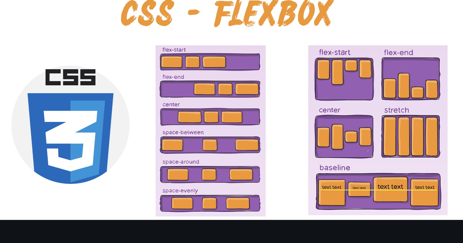
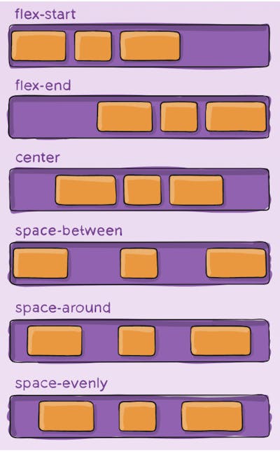
justify-content
This defines the alignment along the main axis. It helps distribute extra free space leftover when either all the flex items on a line are inflexible, or are flexible but have reached their maximum size. It also exerts some control over the alignment of items when they overflow the line.
flex-start (default): items are packed toward the start of the flex-direction.
flex-end: items are packed toward the end of the flex-direction.
start: items are packed toward the start of the writing-mode direction.
end: items are packed toward the end of the writing-mode direction.
left: items are packed toward left edge of the container, unless that doesn’t make sense with the flex-direction, then it behaves like start.
right: items are packed toward right edge of the container, unless that doesn’t make sense with the flex-direction, then it behaves like start.
center: items are centered along the line
space-between: items are evenly distributed in the line; first item is on the start line, last item on the end line
space-around: items are evenly distributed in the line with equal space around them. Note that visually the spaces aren’t equal, since all the items have equal space on both sides. The first item will have one unit of space against the container edge, but two units of space between the next item because that next item has its own spacing that applies.
- space-evenly: items are distributed so that the spacing between any two items (and the space to the edges) is equal.
.container {
  justify-content: flex-start | flex-end | center | space-between | space-around | space-evenly | start | end | left | right ... + safe | unsafe;
}
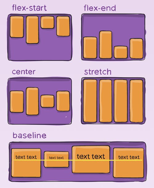
align-items
This property defines the default behavior for how flex items are laid out along the cross axis on the current line. Think of it as the justify-content version for the cross-axis (perpendicular to the main-axis).
stretch (default): stretch to fill the container (still respect min-width/max-width)
flex-start / start / self-start: items are placed at the start of the cross axis. The difference between these is subtle, and is about respecting the flex-direction rules or the writing-mode rules.
flex-end / end / self-end: items are placed at the end of the cross axis. The difference again is subtle and is about respecting flex-direction rules vs. writing-mode rules.
center: items are centered in the cross-axis
baseline: items are aligned such as their baselines align
.container {
  align-items: stretch | flex-start | flex-end | center | baseline | first baseline | last baseline | start | end | self-start | self-end + ... safe | unsafe;
}
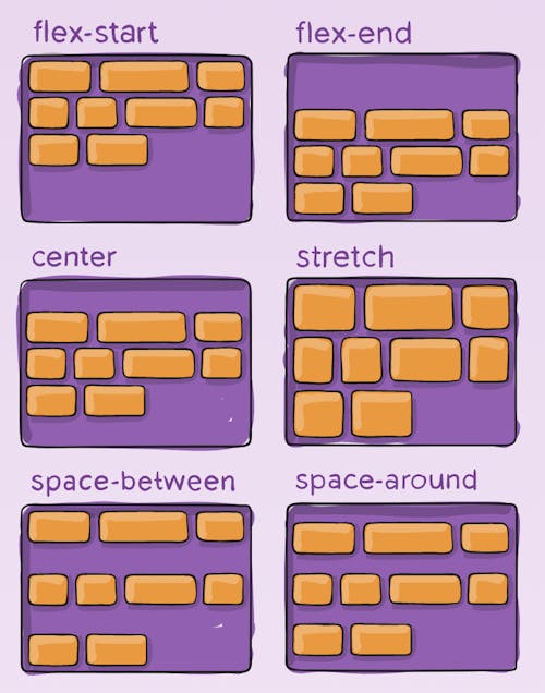
align-content
This aligns a flex container’s lines within when there is extra space in the cross-axis, similar to how justify-content aligns individual items within the main-axis.
.container {
  align-content: flex-start | flex-end | center | space-between | space-around | space-evenly | stretch | start | end | baseline | first baseline | last baseline + ... safe | unsafe;
}
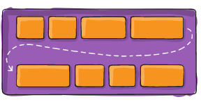
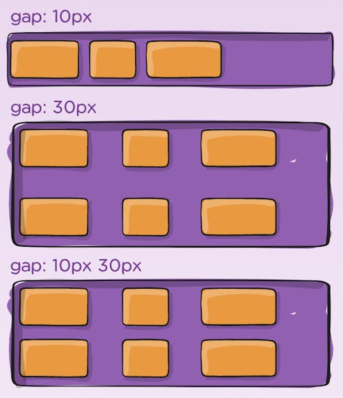
gap, row-gap, column-gap
The gap property explicitly controls the space between flex items. It applies that spacing only between items not on the outer edges.
.container {
  display: flex;
  ...
  gap: 10px;
  gap: 10px 20px; /* row-gap column gap */
  row-gap: 10px;
  column-gap: 20px;
}
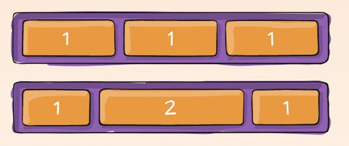
flex-grow
This defines the ability for a flex item to grow if necessary. It accepts a unitless value that serves as a proportion. It dictates what amount of the available space inside the flex container the item should take up.
If all items have flex-grow set to 1, the remaining space in the container will be distributed equally to all children. If one of the children has a value of 2, that child would take up twice as much of the space either one of the others (or it will try, at least).
Negative numbers are invalid.
.item {
  flex-grow: 4; /* default 0 */
}